

Do's and Don'ts on Designing for Accessibility
I wanted to share this great resource from the @UKGovOfficial Home Office Digital, Data and Technology.
They created a series of posters called the "Dos and Don'ts on designing for accessibility."
Currently, there are six posters in the series that cater to users from these areas:
low vision
D/deaf and hard of hearing
dyslexia
motor disabilities
users on the autistic spectrum
users of screen readers
This particular poster shows the Dos and Don'ts of Designing for Users who are D/deaf or hard of hearing.
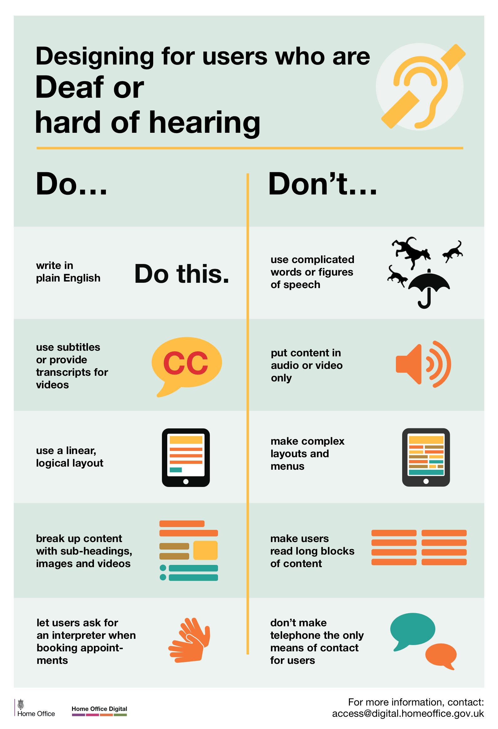
Don’t use complicated words or figures of speech
Do write in plain English
Don’t put content in audio or video only
Do use subtitles or provide transcripts for videos
Don’t make complex layouts and menus
Do use a linear logical layout
Don’t make users read long blocks of content
Do break up content with sub-headings, images and videos
Don’t make telephone the only means of contact for users
Do let users ask for an interpreter when booking appointments