

Butter Yellow Is Great to Wear. Maybe Don't Use It in Design.
Butter yellow can be a fashion win and an accessibility headache — but not all yellows are created equal.
Butter yellow is having a moment. Soft, creamy, pale sunshine yellow showing up on runways, in editorial spreads, on accessory launches, all over Pinterest boards. It's the color of the year in fashion, and I'd wear it with hot pink pants!
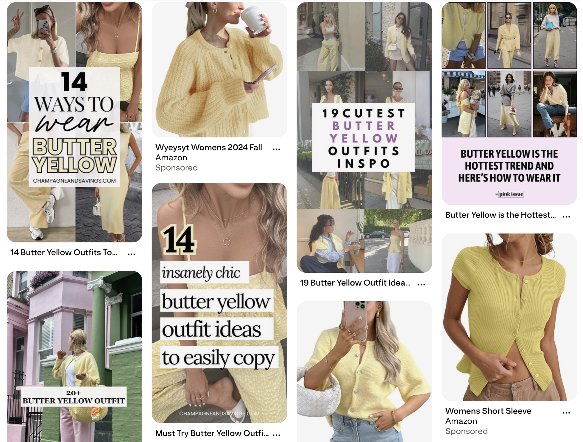
Here's the thing, though. What works on as a cute cardigan does not work as body copy on your website.
Don’t go panicking just yet! If yellow is already in your palette, hang tight! I'm not here to blanket-ban yellow. There's a difference between butter yellow (bad at its job in most design contexts) and mustard yellow (genuinely lovely and often accessible). This post is about knowing which is which.
If you've read my post on why orange fails color contrast, you already know where this is going. Yellow has its own version of the same problem.
Why Butter Yellow Is So Hard
Butter yellow's biggest strength is also its biggest accessibility weakness: it's pale. That softness is what makes it feel calm and sophisticated instead of loud and kindergarten-bright. It's also what makes it essentially invisible on a white background.
Color contrast isn't about whether you can read something on your perfectly-calibrated monitor in your well-lit office. It's about whether the full range of humans trying to engage with your content can read it, people with low vision, people with color vision deficiencies, people reading on a phone in direct sunlight, people with migraines, people whose eyes are just tired at the end of a long day.
WCAG (the Web Content Accessibility Guidelines) sets the standards here.
Regular body text needs a contrast ratio of at least 4.5:1 against its background.
Large text (18pt+, or 14pt bold) needs 3:1.
UI elements like buttons and icons need 3:1 against whatever sits next to them.
Butter yellow, in most of the popular shades floating around right now, does not pass 4.5:1 on white. It often doesn't pass 2:1. That's not "close but needs a tweak." That's "invisible to a significant portion of your audience."
This is a Thing Actual Designers are Wrestling With
Janna Carlson, co-owner of a web design company and founder of The Co-Promotion Club, shared my orange post on LinkedIn. In the comments, brand designer Camilla Behrens jumped in to point out that yellow is sadly difficult too and Janna immediately confirmed it. She'd hit the same wall building out the Co-Pro Club palette and ended up committing to dark brown and cream for all text, forever, because yellow simply would not cooperate in the places she originally wanted to use it.
Camilla followed up with something I wish every designer reading this could tattoo on their forearm: at Camilla’s studio, they consider accessibility at the beginning of brand identity creation, way before they get into application.
As a brand designer, your move is to take accessibility into account at the start of the brand identity process, you don't end up with a palette you fall in love with and then spend three years fighting. You end up with a palette that was built to work from day one.
And Janna replied to Camilla with something I feel in my bones: she's been amazed by how many brand designers don't pay close enough attention to this. Same. Every week I look at gorgeous new brand rollouts and watch them fail contrast checks in ways the designers probably never considered.
What About Mustard Yellow?
Here's where the yellow story gets interesting: mustard yellow is great. I love mustard yellow. I have it in my own living room as a couple of pops of color. Used with black, it can borderline feel like a bumblebee (which you may or may not want.)
Janna's site, thecopromotionclub.com, has mustard yellow showing up as an accent and a supporting color — warm, retro, nostalgic — but the colors that are workhorses are dark brown and cream. Headlines, body copy, the stuff that actually has to be read lives in that brown-on-cream pairing. Mustard gets to be the mood. Brown does the job.
That's not a compromise. That's the design working exactly the way color should work in an accessible brand system. Every color has a role, and the color with the best contrast does the most critical reading work.
Could mustard yellow pass contrast for text in some pairings? Sometimes, yes, especially against deep brown or dark navy, and especially at large sizes. A rich mustard on dark chocolate brown can be stunning and accessible as Janna displays on her site! Janna made the right move, which was to let mustard do what mustard does best (bring warmth and personality) and let a grounded dark color do what a grounded dark color does best (carry the meaning).
The lesson here: if you want yellow in your palette, which yellow makes a difference. The deeper and more saturated you go, the more design jobs the color can actually handle. Butter yellow is almost purely decorative. Mustard yellow can work, especially when it's paired intentionally.
"Just Put It on a Dark Background" Is Not the Answer
Before someone jumps in with the classic workaround: if butter yellow doesn't pass on white, slap it on black. Or navy. Or purple. Problem solved.
Or maybe not.
First, the pretty, but fails category.
Both of these designs are fun and pretty. The mustard and cream palette is dreamy. Using soft yellow on a greige (BTW my old dining room had this awesome greige color on the walls), such a unique color palette. And both fail color contrast. The cream-on-mustard is too close in value to meet the standard, and the soft yellow on greige is easy to miss text, readable if you already know what it says, invisible if you don't.
This is exactly why "looks good to me" is not the test. Beautiful designs fail all the time. Your eyes adapt. Contrast checkers don't.
Second, the passes-but-watch-the-vibe category.


Both of these pairings pass WCAG contrast standards just fine. Yellow on deep navy, yellow on royal purple, plenty of value separation, totally readable. So from a pure accessibility standpoint, you're in the clear.
But look at the vibe. That's the Michigan Wolverines. That's the LA Lakers. That's a Little League banner. Nothing wrong with that, if you are a sports team, or a kids' camp, or a brand going for retro varsity energy. If you wanting to use butter yellow in your brand? These combinations puts your brand into a completely different world.
So the takeaway isn't "never put yellow on dark." It's this: contrast is the baseline, not the finish line. Your yellow has to clear the contrast bar and match the vibe you're going for.
Third, what it looks like when it actually works.
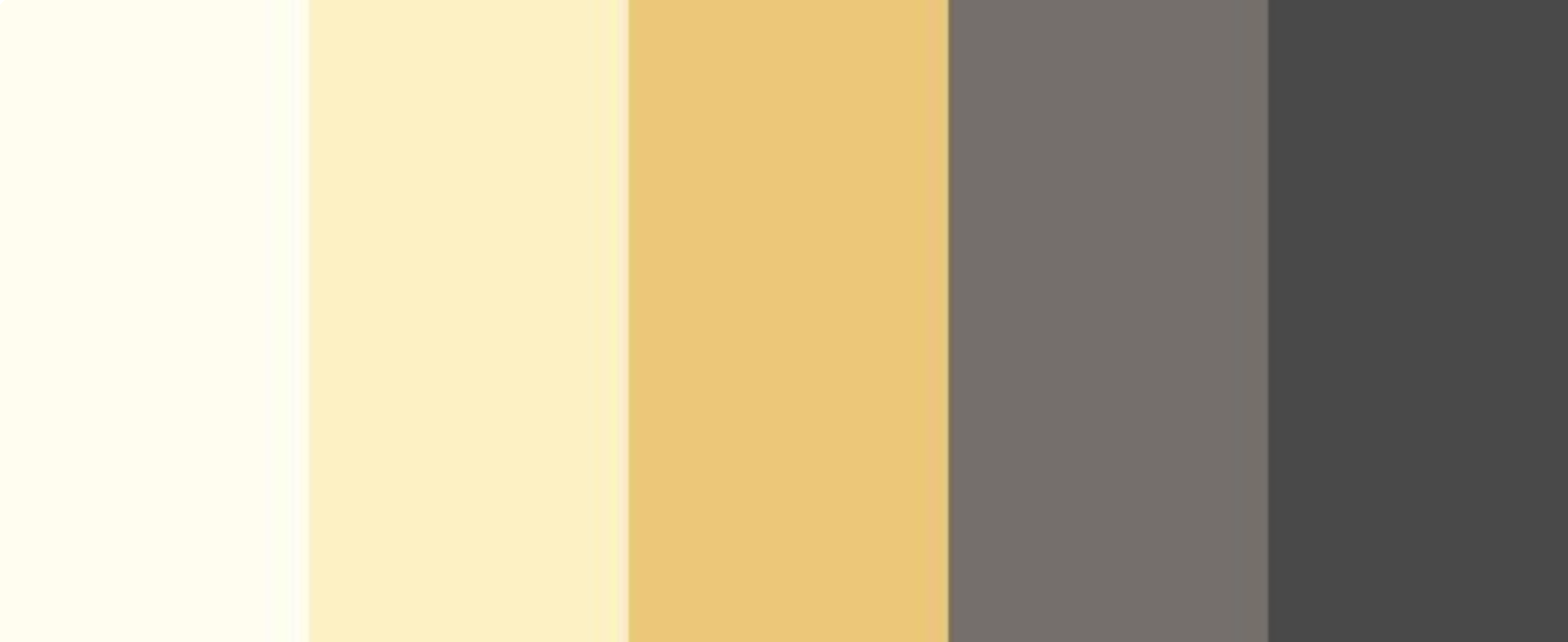
This is the kind of palette I gravitate towards if I’m looking for something different beyond a pink and blue color palette. You've got the soft yellows (cream and butter) for backgrounds and accents. You've got mustard for mid-tone warmth and personality. And you've got warm grey and charcoal on the right end to do the text and UI work.
The charcoal color is doing all the heavy lifting that the butter yellow can't. This is a palette where yellow gets to be the vibe and a darker anchor carries the meaning.
Mustard on dark brown, navy, or charcoal works the same way, different story entirely from butter yellow in the same spots. Mustard has the pigment depth to feel intentional on a dark background instead of an orange safety cone. That's part of why it's such a staple of retro and mid-century-inspired design, it was built to pair with depth.
The Sneakier Yellow Problem
This is the trap that catches most brand designers, and it's the same one orange sets. Yellow on white is a problem you can kind of see with your eyes if you squint. But light yellow against the other soft, warm brand colors? That's where it gets genuinely sneaky.
Butter yellow on cream. Butter yellow on blush. Butter yellow on pale peach. Butter yellow on off-white. Butter yellow on sand.
These combinations look gorgeous together. They feel cohesive and editorial and intentional. And when you check them in a contrast checker, most of them fail harder than butter yellow on plain white because now you have two light, warm colors with almost no value difference between them.
That's not a failure of your taste. That's the color's actual behavior. Our eyes weren't trained to catch this. They were trained to see what feels harmonious. But harmonious and accessible are not the same thing.
How to Actually Use Yellow (Butter or Otherwise) in a Brand System
If you're building a palette right now and any shade of yellow is on the mood board, here's the process:
Think about accessibility at the identity stage, not the application stage. Camilla said it better than I can. By the time a brand is in application, website, email templates, launch graphics, changing the yellow feels impossible. Bake the contrast check into the palette development itself.
Match the yellow to the job. If yellow is purely a supporting accent on backgrounds and decorative elements, butter yellow can work beautifully. If yellow needs to do any reading work such as: headlines, buttons, UI, you probably need to drift toward mustard, amber, or goldenrod instead.
Pair yellow with a high-contrast anchor. Janna's answer was dark brown and cream. Yours might be deep navy, charcoal, forest green, or aubergine. Pick a grounded partner that can carry the functional work, and let yellow be the personality.
Never put butter yellow on cream and call it a palette. If two light warm colors are the foundation, something dark has to show up to do the text, the buttons, and the key UI. Otherwise you're building a brand that a lot of people cannot actually read.
Run your combinations through a contrast checker early. WebAIM has a free one. Here's my walkthrough of how to use a contrast checker if you haven't before. Do this before the logo is approved, not after the website is half-built.
Use a tool that catches issues while you work. This is exactly the kind of thing Successible flags — low contrast combinations, including the sneaky warm-on-warm pairings that look fine until you run the numbers. It works like spellcheck for accessibility. No contrast checker expertise required.
Want to See This in Action? Join the May 4 Demo
If you're reading this thinking, "okay, I get it, but what does catching this stuff actually look like inside a client build?" that's what the May 4 Successible demo is for.
I'm not teaching you how to design. You already know how to design. What I'm doing is showing you Successible running live inside Squarespace and Wix so you can see exactly how it fits into your client workflow, what it flags, how fast it flags it, and how to handle the fix without turning the conversation into a lecture.
What you'll actually see:
A client-style site getting run through Successible in Squarespace, with the panel populating in real time
The contrast flags, along with alt text, heading hierarchy, and caption issues
The same tool on a different platform (Wix/Showit) so you can see how it travels with you between client builds
A short segment on the client side of this work: how to use accessibility as a selling point in proposals, how to frame fixes without killing a client's excitement about their palette, and how to make this a deliverable or a maintenance line item
You'll see the tool, you'll see the workflow, you'll see how this becomes part of what you already do, not an extra thing bolted on. And you'll walk away knowing whether Successible is something you want in your stack (which you do!)
If you've ever handed over a brand and then wondered whether the client was going to get an accessibility complaint three months later, this is the demo for you.
Here's what I want you to take away from this:
Butter yellow is beautiful to wear! But it's tricky in a brand system. Mustard yellow is gorgeous in a brand system too, as long as you pair it with something that can actually carry the text.
Loving yellow doesn't make you a bad designer. Using yellow doesn't make your brand inaccessible by default. But assuming it's fine without checking? That's the part we can fix.
You don't have to choose between joyful, expressive color and accessibility. You get to have both, if you're willing to get curious, test your assumptions, and treat accessibility as a creative parameter instead of a constraint.
Progress, not perfection. Every time.
Want to stop guessing whether your designs are accessible? Successible checks color contrast automatically, so you don't have to catch it yourself.