

How Does Color Contrast Work?
A Candid Guide To Colors People Can Actually Read
I love a gorgeous color palette as much as anyone. Give me earthy neutrals, jewel tones, neons, pastels—I will swoon over all of it. But if people can’t read the text on your graphics, website, or course slides, that “pretty” color combo turns into a barrier.

And when we’re talking about barriers, we’re not just talking about “oops, someone had to squint.” We’re talking about people being locked out of your content, your offers, and your community. That’s where digital accessibility and color contrast step in. Color contrast makes your visual content readable. Captions and transcripts make your audio and video content accessible. Together, they ensure more people can actually engage with what you create.
In this post, we’re going to unpack how color contrast actually works, who it affects, and how you can use a color contrast checker (including tools like Successible) to make sure your brand is both beautiful and readable.
What Color Contrast Actually Is (Beyond “Light vs Dark”)
When we say “color contrast,” we’re talking about how much difference there is between two colors that sit next to each other—usually text and background.
Think of it like this:
Imagine you’re trying to read a street sign at night. The sign with bright white letters on a deep green background? You can probably read that quickly, even from a distance. Now imagine the same sign, but with pale yellow letters on a slightly lighter yellow background. Still technically “readable”? Maybe. Easy? Not at all.

That difference in how clearly you can see the text is color contrast at work.
On screens, contrast isn’t just about light vs dark at a gut level; it’s measured as a ratio. You’ll see numbers like:
4.5:1
3:1
7:1
These numbers come from the Web Content Accessibility Guidelines (WCAG), which set standards for digital accessibility. The higher the ratio, the stronger the contrast.
For most body text, WCAG recommends a minimum contrast ratio of 4.5:1 between text and background. For larger text (18pt and up, or 14pt bold), the minimum is 3:1. AAA (a stricter standard) goes up to 7:1 for regular text.
You don’t have to memorize the numbers, but you do need to know: your “this looks fine to me” eyeball test is not enough. That’s why an accessibility color checker is so important.
Who Low Contrast Actually Affects (Spoiler: More People Than You Think)
When folks hear “accessibility,” they often picture one very specific kind of disability. But low contrast colors impact a huge range of people, including:
People with low vision
This includes people who are legally blind, people who use screen magnifiers, and people whose vision is blurry, hazy, or limited in certain parts of their visual field. Low-contrast text can blend right into the background, especially when enlarged.
People who are color-blind
Color-blindness doesn’t just mean “can’t see red or green.” It can mean certain colors look very similar or muddy. Two colors you see as “totally different” may be practically identical for someone else—especially if the contrast is already low.
People with cognitive or learning disabilities
When contrast is low, the brain has to work harder to decode the words. That extra mental load can be exhausting and make it harder to process the content itself, especially for people with dyslexia or processing differences.
People using devices in less-than-ideal conditions
Think about trying to read an Instagram story in bright sunlight, or a sales page on a tiny phone with your screen dimmed. Even people with “perfect” vision suddenly struggle with low-contrast designs.
Older adults
As we age, our eyes change. Cataracts, macular degeneration, and general decreased contrast sensitivity make low-contrast text especially hard to read.
This is why digital accessibility is not a niche concern. It’s people. It’s your audience. It might be you—on a migraine day, in bright light, or trying to read while tired.
Why Color Contrast Matters For Your Business (Beyond “Checking a Box”)
Let’s be candid: a lot of accessibility talk gets framed like a chore. Something you “have to” do so you don’t get in trouble or look bad. But when it comes to color contrast, the benefits are actually deeply practical and relational.
When your colors are accessible, you:
Reduce friction: If someone has to squint, zoom, or tilt their screen like they’re trying to catch a secret message, they’re working way too hard. That friction is a fast track to closing the tab or tapping past your post.
Build trust and safety: People notice when your brand feels easy to access. They may not say, “The contrast ratio of this button is excellent,” but they will feel: “This is easier to read. I feel considered here.” That sense of being considered builds trust.
Increase conversions: Your buy buttons, your key messages, your instructions—if they’re hard to read, they’re easy to ignore. Clear contrast means your most important content actually gets seen and understood, which directly impacts sales, signups, and engagement.
Align with your values: If you say your brand is about equity, inclusion, or justice, but your content is literally unreadable to a chunk of your audience, there’s a disconnect. Color contrast is one of the most tangible, concrete ways to start living those values in your digital spaces.
And when you build accessibility into your business from the ground up, it becomes strategy, not damage control.
How a Color Contrast Checker Works (And Why Your Eyes Aren’t Enough)
Our brains are sneaky. They get used to our own brand colors and screens. So you might look at soft gray text on a pale background and think, “It’s fine. I can see it.” Meanwhile, a third of your audience is struggling.
This is where a digital accessibility tool like a color contrast checker comes in. Instead of guessing, you:
Grab the color values (usually HEX codes, like #FFFFFF for white or #000000 for black) for your text color and your background color.
Plug them into a color contrast checker or accessibility color checker.
The tool calculates the contrast ratio and tells you whether it passes or fails WCAG standards for normal and large text.
It’s math, not vibes.
When you use a tool like Successible, it goes one step further: it doesn’t just check random codes—you can test the actual text and background colors where you’re creating your content. That might be in your social media graphics, website sections, slide decks, or PDFs.
Instead of “I think this is okay,” you get, “This passes AA for normal text” or “This fails; here’s what you might adjust.”
That information is power. It means you can make intentional choices instead of unintentional barriers.
Common Color Contrast Mistakes (You Might Be Making These Right Now)
Let’s talk about some of the repeat offenders I see all the time as a former graphic designer turned accessibility educator:
Light gray text on white

The classic “modern minimal” look that is so chic and so unreadable. That soft gray might work for large headlines, but it’s often not enough contrast for body copy or small text.
Pastels on pastels
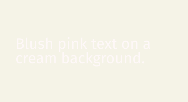
Blush pink text on a cream background. Mint on teal. Lavender on periwinkle. Lovely in a mood board, painful in real life. If your palette is mostly soft tones, you’ll need at least one darker anchor color for text.
Text over busy images
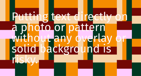
Putting text directly on a photo or pattern without any overlay or solid background is risky. Parts of the text might have good contrast, and other parts might completely disappear depending on what’s behind it.
This is especially common on Instagram stories and LinkedIn carousels: check out the full social media accessibility checklist.
Tiny text (even if the contrast is okay)
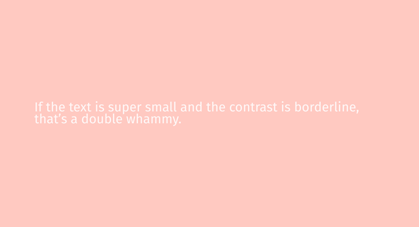
If the text is super small and the contrast is borderline, that’s a double whammy. Accessible contrast assumes a reasonable font size. If you’re using tiny captions or microcopy, you’ll want the contrast to be extra strong.
Relying on color alone to convey meaning
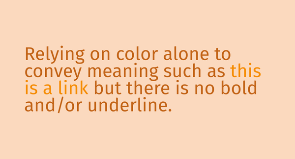
Even with great contrast, if the only difference between “active” and “inactive” buttons is color, or the only way you indicate errors is red text, people with color-blindness or low vision may miss the meaning. Contrast matters, but it’s one part of the accessibility story.
Just like alt text makes images accessible to screen reader users, good contrast makes your visual content readable for everyone.
None of these choices make you a bad designer or a bad person. They just mean you were taught to value aesthetics over access. Now you get to expand that lens.
Making Your Brand Colors More Accessible (Without Burning Everything Down)
You do not have to throw out your brand palette and start from zero. Accessibility doesn’t mean everything becomes high-contrast black and white. It means creating accessible options and using them intentionally.
Here are some ways to keep your brand identity while improving digital accessibility:
Use your darker colors for body text
If you have a deep navy, charcoal, or saturated color, use that for most of your text instead of a pale or mid-tone shade. Even if your brand “feels light,” your text can be darker and still fit within the vibe.
Introduce an “accessible text” color
Maybe your palette didn’t originally include a true dark color. You can add one. Call it your “accessibility anchor.” Use it for paragraphs, buttons, and important messaging. Your lighter colors can still show up in backgrounds, accents, and illustrations.
Adjust shades slightly
Sometimes all it takes is darkening a background color by 10–20% or deepening your text color to bump the contrast into passing territory. This is exactly where a color contrast checker shines—tiny tweaks can make a huge difference.
If you're using an email platform like Flodesk, make sure your email designs meet contrast standards. Here's how to create accessible emails in Flodesk with proper contrast, alt text, and more.
Use overlays or boxes on images
If you love text on photos, add a semi-transparent overlay (like a dark layer at 60% opacity) or a solid box behind the text. Then check that text color against the overlay, not the image itself.
Build accessible “states” for buttons and links
Make sure default, hover, and active states all have enough contrast with both the background and each other. And don’t rely solely on color to show that something is clickable: use underlines, borders, or icons too.
The goal isn’t perfection. It’s movement toward a world where more people can comfortably engage with your work.
How Successible Helps You Check Color Contrast In Real Life
Let’s circle back to that pop quiz feeling from the beginning:
You’re looking at a few palettes and wondering, “Which of these actually passes contrast standards?” It’s not obvious by just looking, especially if your own eyes and screen are used to your brand.
This is the gap Successible is designed to fill. Instead of making you guess or copy-paste codes from 15 different places, it helps you test text and background colors right where you create your content.
You can think of it as your built-in accessibility color checker:
You choose your text and background right in your project.
Successible runs the numbers in the background.
You get a clear yes/no answer on whether your combo meets digital accessibility standards.
No shame. No scolding. Just information, so you can adjust before that graphic gets posted, that slide gets presented, or that landing page goes live.
Because the truth is, most people are not trying to exclude anyone. They’re just not being given the tools, language, or training to make inclusive choices. Tools like Successible change that by making the “right thing” the easy thing. Successible is just one of several accessible tools that make running an inclusive business more doable.
Color contrast is not just a design detail; it’s a doorway.
Done poorly, it quietly locks people out of your content, your offers, and your community. Done well, it says: “You’re meant to be here. Your access matters to me.”
You don’t have to become a WCAG expert overnight. You don’t have to give up your aesthetic or burn your brand to the ground. You just need to:
Learn what color contrast really is.
Understand who it affects (hint: a lot of people).
Use a color contrast checker or accessibility color checker—like Successible—to base your choices on data, not guesswork.
Every time you choose a more readable color combination, check your heading structure, or write descriptive alt text, you're making a small but real move toward digital accessibility and justice.And if you ask me, that’s a much better look than any trendy palette.
Learn how color contrast works, why it matters for digital accessibility, and how to use a color contrast checker to create readable, inclusive designs.