

Purple Has Range. Your Color Contrast Has to Keep Up.
A monochromatic purple palette can absolutely work very well. It’s just the other color combinations that catch most brands off guard.
One of my favorite design moves is a monochromatic purple palette: deep, saturated eggplant paired with soft, dusty lavender. Two shades from the same family, doing different jobs in the same composition.
Monochromatic purple actually works, and it works well, as long as the two shades are far enough apart in value to clear color contrast standards. Done right, it's one of the most sophisticated, on-brand moves in the toolkit. The challenges with purple show up in the other combinations such as:
purple with pink
purple with orange (I’m obsessed with this combo!)
purple with another purple that's only one shade off
dark purple boxes on bright purple backgrounds.
That's where things get sneaky, and that's where most purple-forward brands fail accessibility without realizing it. If you've been following along with my posts on orange and butter yellow, you know the pattern: I'm not here to ban a color. I'm here to walk through where it earns its spot, where it doesn't, and how to tell the difference.
Why Purple Is So Beloved (And So Wide-Ranging)
Purple has the widest range of any color I work with. On one end, you've got pale lavender and lilac, almost pastels that read as soft and airy. On the other end, you've got deep aubergine, plum, and royal purple that feel luxurious and grounded. And then everywhere in between: orchid, mauve, periwinkle, grape, mulberry, wisteria. This range is used by many different types of businesses such as wellness brands, beauty brands, women-led businesses, spiritual and intuitive practices, female-founded tech. Purple shows up everywhere in these spaces because it can flex from "ethereal and soft" to "powerful and grounded" without ever leaving the family. But that same range is where the accessibility nuance lives. According to the Web Content Accessibility Guidelines (WCAG), normal body text needs a contrast ratio of at least 4.5:1, and large text or key UI elements need at least 3:1. Whether your purple combination passes depends entirely on which two shades you've put together, not just which colors they are, but how far apart they sit in value. Let's walk through what that actually looks like in real brands.
Monochromatic Purple Done Right

My own brand uses two main purples: a deep, jewel-toned purple (#7B2C72) and a soft, dusty lavender (#DBBBD4). I use them together constantly — the deep purple as text or a background block, the lavender as an accent or a soft background. The contrast ratio between those two shades is 4.94:1, which clears WCAG for normal-size body text.
That's the formula: the two purples are far enough apart in lightness that one can carry text against the other.
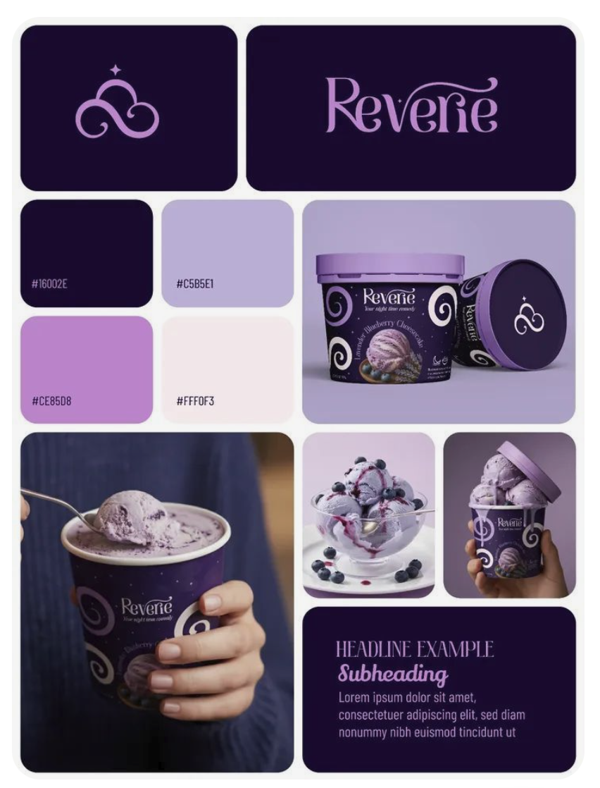
This Reverie ice cream brand is a great example.
The deep eggplant against the lavender achieves a 9.3:1 contrast.
The cream-white against the eggplant passes with flying colors at 15.8:1 contrast.
The brand can use those pairings for text, packaging copy, and headlines all day long.
However, it's not a free-for-all within the palette. If you were to use the lavender on the creamy pink, or the brighter mid-purple with the lavender, both would fail the color contrast test.
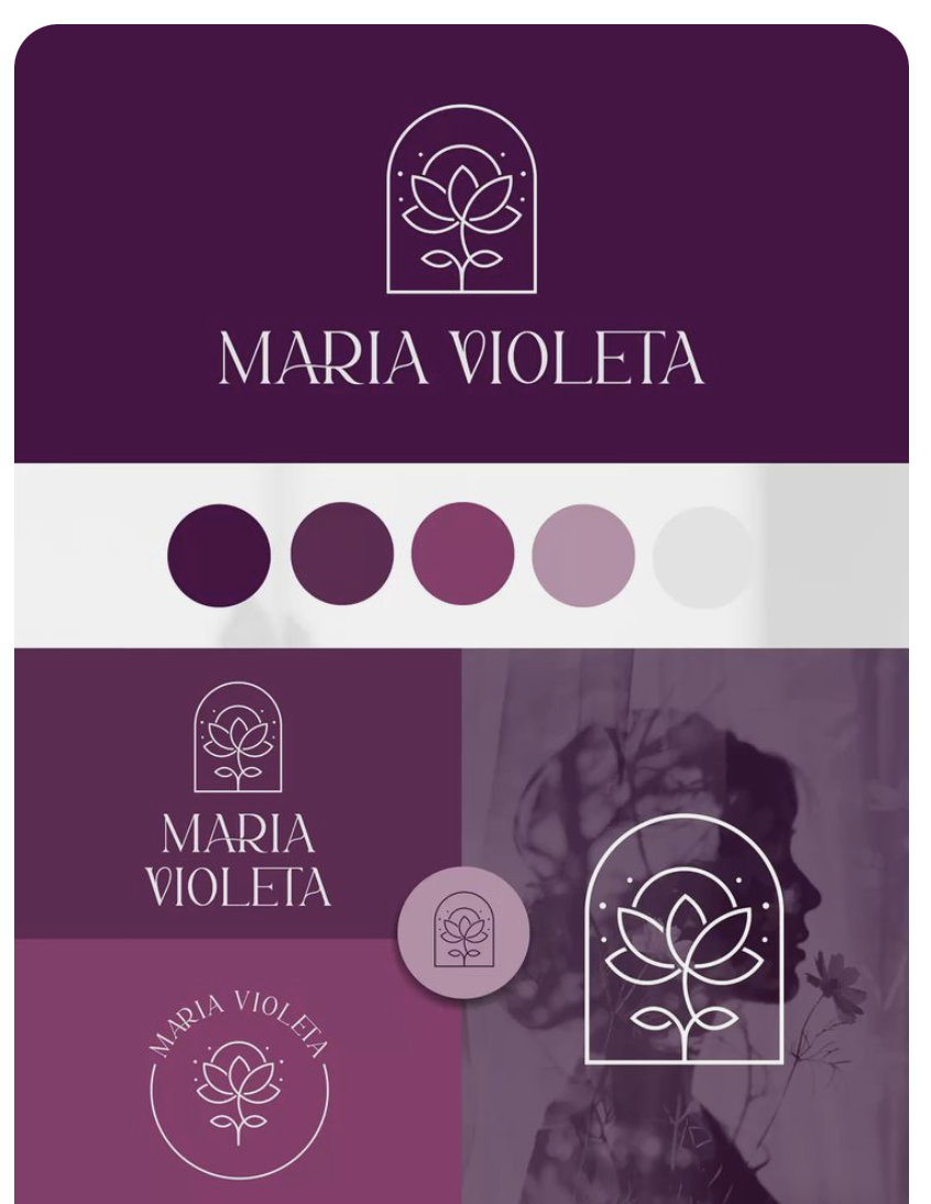
Maria Violeta’s branding works the same way. You've got four purples that span a wide value range, from a deep aubergine to a near-white grey. The deep aubergine against the lightest grey passes contrast easily. The lightest grey against the deepest aubergine works as text. But you can't grab any two adjacent swatches and expect them to play nicely together. The mauve next to the dusty pink-purple? Just doesn’t work at all. The takeaway: Don't assume "all my brand colors look good together" means "all my brand colors work together."
Where Monochromatic Purple Goes Wrong

Now let's look at what happens when the two purples aren't far enough apart in value. The Subtle Flex color palette is harmonious.
And it sits at 3:1, which fails WCAG for normal text. The colors are just too close in lightness for one to carry the other. You can use it as large text only. You have to pay attention to when you use this combination. Which is why doing color checks is so important! This is the trap most monochromatic purple brands fall into, the two shades are harmonious, and they’re limited with how they can use it.

Aussie is a globally recognizable, beloved brand and even they trip over this. Dark purple text on a medium lavender background sits around 3.6:1. This passes for large text but doesn't quite clear the bar for normal body copy.
So if they were to use the dark purple with the medium lavender background, it has to be large text only. The takeaway is: even big famous brands with full design teams sometimes land just below the line on monochromatic purple combinations. It happens. It just means you gotta pay attention to the rules!
The Sneaky Layering Problem
Now here's where it gets sneaky. Designers love putting a darker purple shape on top of a brighter purple background such as a button, a card, a callout box and that move almost always trips contrast. When you're layering elements in the same color family, you've got to be mindful of what's sitting underneath.
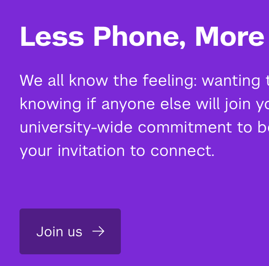
This NYU campaign banner is a great teaching example because it's mostly doing things right and it has one clear miss. The white text on the bright purple? That clears 6.7:1, passes easily. Beautiful, readable, accessible. Good work.
But the darker purple "Join us" button sitting on the bright purple background? That's at about 1.7:1, which fails badly. Your eye reads it as a button because it's a different shade and a different shape, but for someone with low vision or contrast sensitivity, the button essentially disappears into the background. The white text inside the button is readable, but the button outline itself is not perceivable. This is something almost any designer could miss because the design clearly intends the button to read as separate. The fix is can be as simple as outlining the button in white, or shifting to a much darker purple, but you have to know to look for it.
What "Out of the Family" Combinations Look Like
Now, what happens when you take purple out of its monochromatic comfort zone and pair it with other colors entirely?
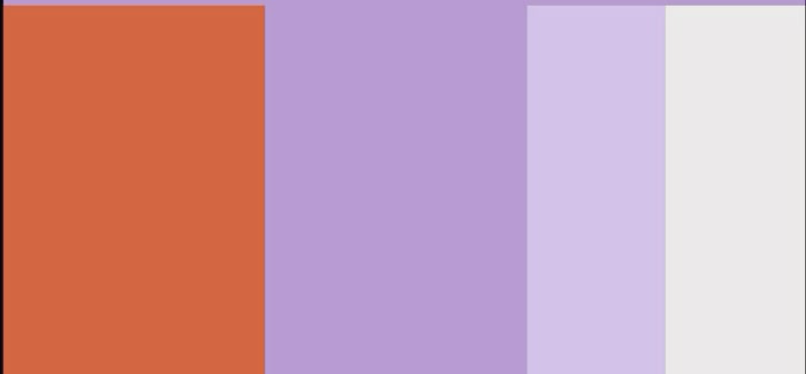
One of my favorite color combinations is when I see orange and purple together, with some lighter neutrals in the mix. The combination looks fresh and unexpected on the swatch board. But the second you start trying to use mid-tone orange and mid-tone purple together for actual text, this spells trouble! They're often at very similar lightness levels, which means they fail color contrast immediately even though they look like they "pop" against each other.
The same goes for purple-and-pink combinations in the mid-tone range, which dominate beauty and lifestyle branding right now. Purple and orange. Purple and pink. Purple and teal. These cross-color pairings can absolutely be beautiful, but they need a clear value relationship to work. One has to be doing the dark work, one has to be doing the light work. If you're using two mid-tones together, you're decorating with two colors that read as one piece of mush to anyone with even mild visual challenges.
When Designers Get Smart About It
Some brands solve this entirely by not relying on color combinations to do the readability work in the first place.
This is Allison Hardy's branding, and it's a brilliant move. Instead of trying to put text directly on her purple, she puts text in a white box on the purple. Black text on white inside a box that sits on a purple background. Which means the contrast for the text itself is 21:1, basically the highest contrast possible. The yellow button has dark text on it, which is 12.88:1. The box edges are doing the design work; the text isn't asking the brand color to do anything beyond being a backdrop. This is such a smart accessibility move that designers can make: stop asking your brand color to carry text, and start letting it be the stage that text-friendly elements sit on top of.

Twitch is another good example. White on Twitch purple hits 4.64:1 (passes). Black on Twitch purple hits 4.52:1 (also passes). The brand color is bright enough and saturated enough that it has flexibility on both ends so their designers can use white or black on top of it, depending on what the design needs. That flexibility is no accident; it's the result of choosing a brand purple that lives in a contrast-friendly value zone.
So How Do You Use Purple Without Stress?
The answer isn't to ban any of these moves. It's to know which combinations work and which ones need help and to check before you commit. If you're working with a monochromatic purple palette, your two main shades need a clear light/dark relationship.
A deep purple and a soft lavender can sing together.
A medium purple and a slightly-lighter purple cannot.
If you're using purple with another color family entirely like: orange, pink, teal, yellow, make sure one of the two is clearly dark and one is clearly light. Two mid-tones from different families will fail just as easily as two mid-tones from the same family.
If you're stuck loving a purple combination that doesn't quite pass, try the Allison Hardy move: put your text in a high-contrast box that sits on top of your purple, instead of asking the purple to carry the text directly. Or shift to a purple that has the value range to carry both white and black on top, like Twitch's.
And if your brand is already purple-forward and you're worried about what's currently on your site? Run it through Successible. It flags low-contrast combinations live as you work, including the sneaky tonal purple pairings that look intentional and fail the math. It works like spellcheck for accessibility, no contrast checker expertise required, no manual hex-by-hex calculations. You just see what's failing and fix it. The goal isn't perfection. It's awareness. Purple is allowed to be your favorite color and your whole brand identity. It just rewards designers who pay attention to which two shades are doing the work in any given moment.
Here's what I want you to take away from this:
Loving purple doesn't make you a bad designer. Using a monochromatic palette doesn't automatically fail. Choosing a purple-forward brand isn't a mistake. The mistake is assuming any two purples will work together because they "go" when really, what matters is whether they sit far enough apart in value to be readable. You don't have to choose between expressive, on-brand color and accessibility. You can have both, as long as you're willing to get curious, run the numbers, and treat accessibility as a creative parameter instead of a constraint. Progress, not perfection. Every time. And if purple is your happy place, you can absolutely keep it, just make sure everyone else can see it too.
Want to stop guessing whether your brand colors are accessible? Successible checks color contrast automatically, so you don't have to catch it yourself.